 Print
Print
1. Description
The ‘Breadcrumb’ is a usual Web Control that shows the path from the site root Item to the current Item, which is basically the current Item’s location in the Sitecore content tree. All links in the breadcrumb are clickable. This allows easy navigation from the current Item to any of its parent Items.
The picture below shows an example of a breadcrumb:

Please refer to the Web Controls article for more information about creating Web Controls.
2. Installation Guide
The ‘Breadcrumb’ Web Control is distributed as a standard Sitecore package; hence in order to start using it, you should install the package. Please refer to the '
Installing Modules and Packages
' article if you are not familiar with the standard Sitecore Packager tool.
After the package installation, you will see the Breadcrumb Web Control in the list of renderings.
Thus you will be able to place it on a (sub)layout or a link via placeholder as another rendering.
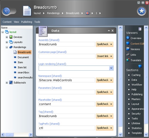
No modifications are required to use this Web Control, but you can modify Breadcrumb’s setting (for example, tag prefix) by editing the following Item:
/sitecore/layout/Renderings/Breadcrumb
3. User Manual
The ‘Breadcrumb’ is a usual Web Contro. Therefore you will be able to work with it like with any other rendering.
To set control properties, double-click it and you’ll see the configuration window. Open the Attributes tab and set properties as described in the example below.

4. Valid rendering properties
DividerClass
Type: System.String
Property value:
The CSS class name for the divider.
Remarks:
The divider is a text or an image used for separating breadcrumb Items.
DividerImage
Type: System.String
Property value:
The name and path of the image file.
Remarks:
The divider image is used for separating Items in the breadcrumb (it is inserted in between breadcrumb Items)
DividerStyle
Type: System.String
Property value:
The CSS style for the divider
Remarks:
The divider is a text or an image used for separating breadcrumb Items.
DividerText
Type: System.String
Property value:
The text (or character) used for separating breadcrumb Items. Please notice that by default this property isn’t set.
TextClass
Type: System.String
Property value:
The CSS class name for the breadcrumb Items' text.
TextField
Type: System.String
Property value:
The name of the field that contains text to be displayed in breadcrumb Items. The default value is "Name".
TextStyle
Type: System.String
Property value:
The CSS style for the breadcrumb Item text.